Hooves and Paws
Overview
Hooves and Paws is an animal rescue organization dedicated to helping animals find homes, encouraging donations, and promoting volunteer engagement. The project focused on improving usability, visual hierarchy, and navigation to enhance user experience and drive conversions.
My Role
UX Designer (UX Research, Visual Design, Prototyping)
Timeline
4 months - Jan 2024 to Apr 2024
HIGHLIGHTS
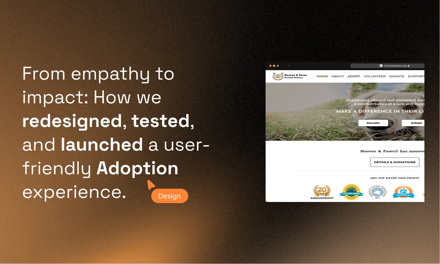
Designing Scalable & User-Friendly Adoption Solutions for Hooves and Paws


CONTEXT
Why This Project Matters?
Helping more pets get adopted.
Hooves and Paws, an animal rescue organization, struggled with a poor user experience, making it hard for users to find pets, donate, and volunteer.
The Challenge
Raising adoption rates and donations by improving user experience while ensuring the design remains accessible and user-friendly.
Barriers to Adoption, Donations, and Navigation

Confusing adoption process
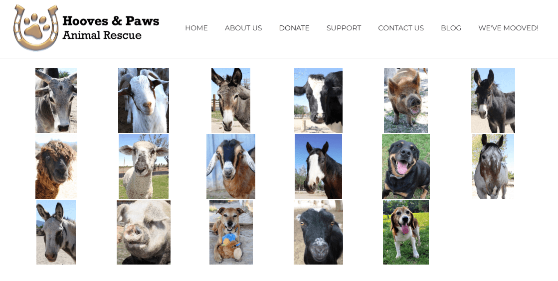
Users had to leave the site to view pets.
Unclear donation flow
No confirmation feedback, leading to donor drop-off.
Navigation issues
Hard to find information, no breadcrumbs, and poor readability
RESEARCH
Listening to User needs & Gathering Insights
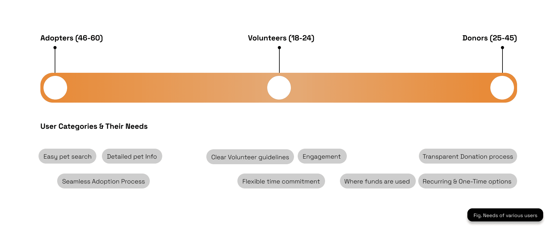
I interviewed 13 participants via surveys, interviews, and quick usability sessions. Their feedback revealed three main user categories—Adopters, Volunteers, and Donors. Each group shared unique needs, from detailed pet info and seamless adoption flows to transparent donation processes and flexible volunteer options.
Usability Testing Insights
I tested three core user flows—Adoption, Donation, and Volunteer Sign-Up—with 13 participants. The orange bars in the chart show how many users had difficulty completing each task, while the beige bars represent the total number of participants.
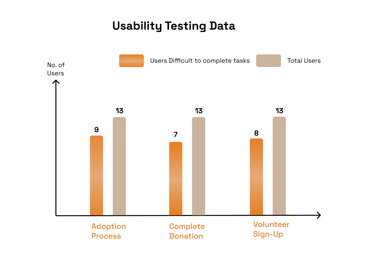
4 out of 9 tasks were abandoned when users couldn’t find “Adopt Me” CTA or pet info pages quickly.
Every 4th participant described the navigation as “hard to track,” citing the lack of breadcrumbs.
90 seconds was the average time spent on the navigation bar, with some users taking up to 3 minutes to locate specific pages.
DESIGNS
Key Problems & Solutions
1.Adoption Process
9 participants encountered difficulties completing the pet adoption flow.


Before
After
Dedicated pet profiles with photos, personality details, and an ‘Adopt ’ CTA.

Kept users on-site instead of redirecting to Petfinder.
2. Complete Donation
7 participants struggled with the donation process, with some questioning its credibility.

Before
Users weren't sure if donations were processed.

After
Transparent donation process with preset contribution amounts and confirmation message.
Volunteer Sign-up
8 participants had trouble navigating to the volunteer page or understanding how to register.
Before
After
Clear Navigation Volunteer.
Highlighted active menu items to give better wayfinding.
IMPACT
After redesigning the prototypes, I conducted another round of usability testing. The results showed

90% of users successfully completed adoption tasks (up from 65% before).

85% of participants made a successful donation (up from 55%).

KEY LEARNINGS
User Research is Everything
Simple Fixes Have Big Impact
Just fixing readability boosted adoption rates.
Testing & Iteration Wins
Post-testing improvements led to a 25% increase in engagement.
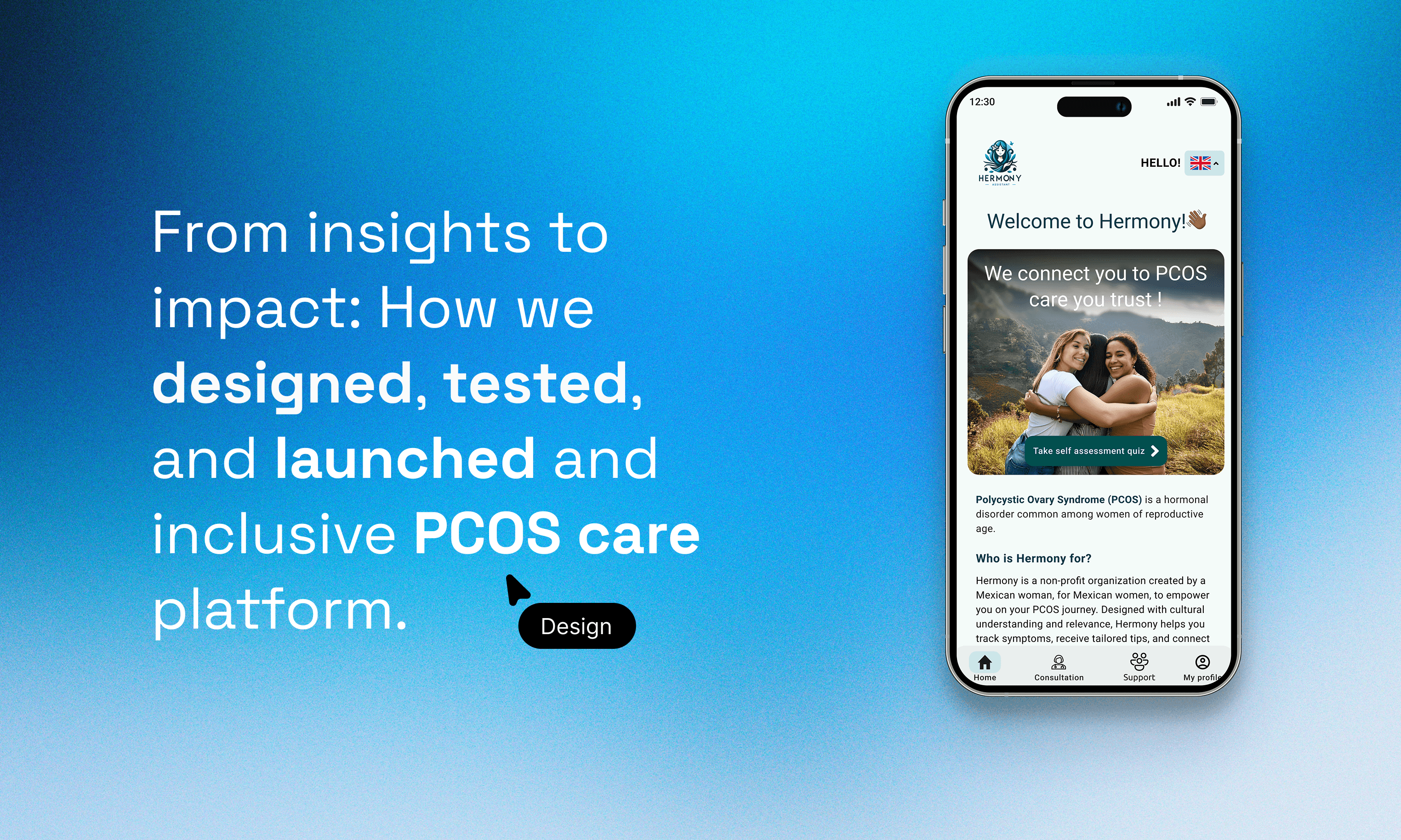
Hermony
Delivering bilingual education, symptom tracking, and telehealth access to empower women affected by PCOS in Mexico
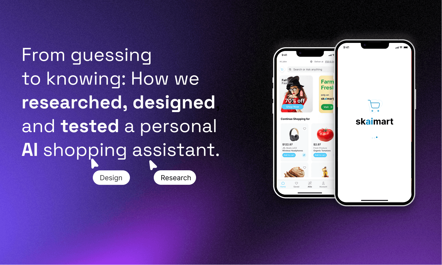
Allie Next Gen E-commerce platform
How I helped design Allie, an AI-powered e-commerce chatbot with a customizable user profile that outperformed Amazon Rufus in A/B testing. 18 of 20 users preferred the experience.